FAIR Data Informatics Lab
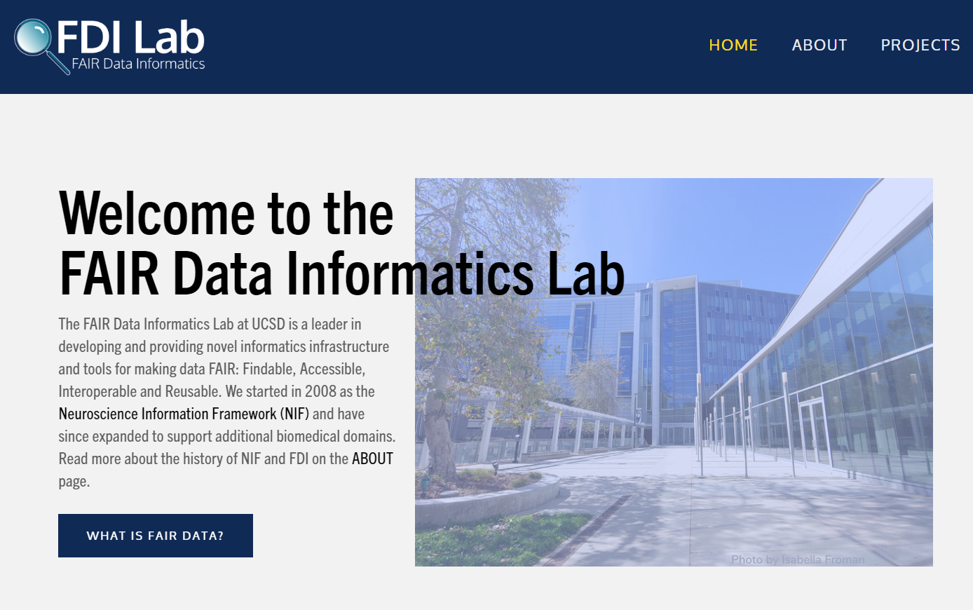
The FAIR Data Informatics Lab is a multi-project data research lab based at UC San Diego. I was the sole designer on their website, and was instrumental in their rebranding efforts.

The Goals
The FAIR Data Informatics Lab’s rebranding was primarily motivated by a need to unify several projects headed by the lab’s multiple Principal Investigators. These projects ranged from databases to research studies, each involving biomedical disciplines such as neuroscience and digestive disease.
With this unification, the laboratory was given its name — shortened to FDI Lab — and needed a website. Being that none of the lab members had experience designing websites, my role was switched from Data Curator to Designer.
The identity of the website needed to be professional and clean with a distinct and sleek aesthetic. I used a deep blue and golden yellow — plucked directly from the UC San Diego logo. This choice solidified its association with the university, as well as created a straightforward color palate that adds personality without infringing on the photos or logos on the site.

The Original Site
Originally, there was no official lab website. The closest approximation was the Scicrunch.org site, which belongs to a specific branch of the project and has some relevant links to other projects — but not much else. Besides that, most of the branches were completely distinct in urls, aesthetics, and purpose. This site was where I sought the most guidance as far as color scheme and iconography. The magnifying glass logo came from the header, as well as the binary motif I used for the desk nametags.

Desk Nameplates
Featuring logo, name (Hello World!), the parent organization (CRBS), and the website url. The design concept for this was something visually salient and visible from afar. I used simple and sharply contrasting colors — dark blue and white. I incorporated the lab’s logo which matches its website, while using the binary number background to add texture. The magnifying glass and binary code were preserved from SciCrunch.com’s original conception to unify the lab’s branches with its central identity.
These nameplates were printed and now sit at each Principle Investigator’s office and each employee’s desk.